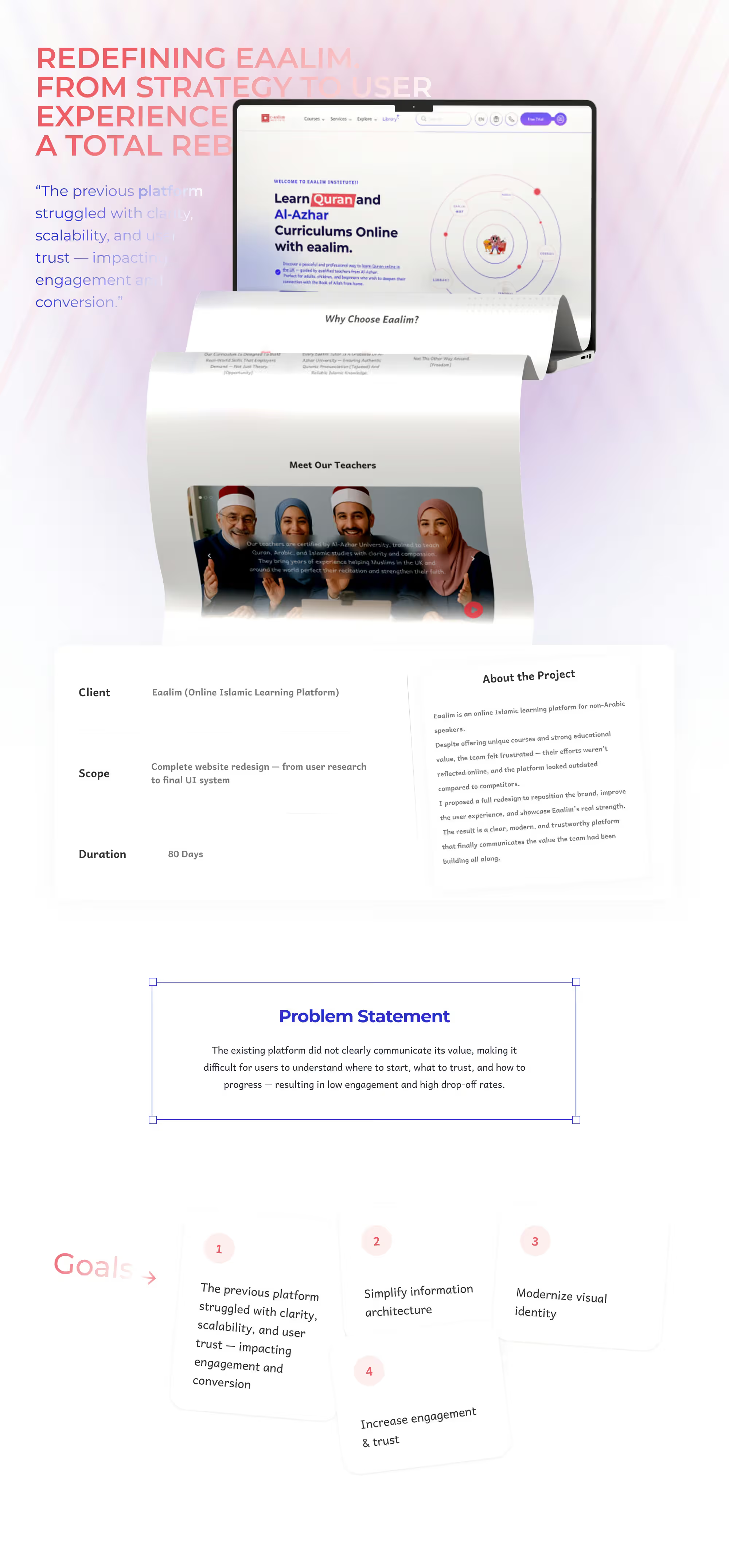
eaalim Platform Redesign — Learn Quran & Al-Azhar Curriculums Online
We redesigned the eaalim platform end to end — from UX flows to UI — and built a unified design system with a reusable component library so the platform can scale with ease. The result: a clearer, simpler sign-up journey that drove a measurable lift in student enrollments.
A Quran learning platform, rebuilt from the experience up
eaalim teaches Quran and Al-Azhar curriculums online to students spread across continents. It came to us with strong teaching content and an experience that didn't reflect it: students got lost before they ever reached a first lesson. We redesigned it from research through to a full design system the platform can grow on.
- Role
- Research, UX and UI
- Sector
- Online education
- Scope
- Full platform + design system
- Languages
- Arabic and English
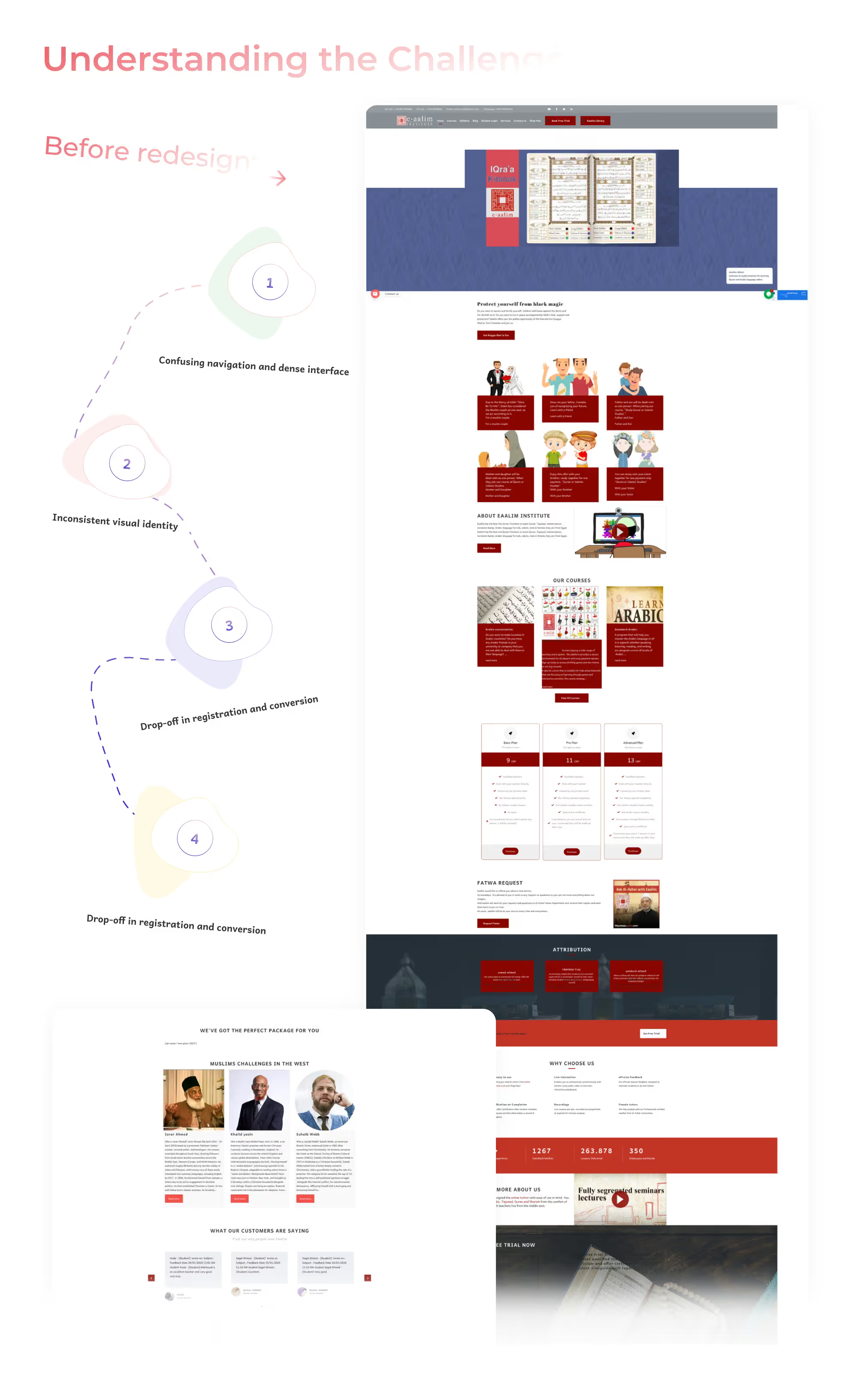
The challenge: excellent content, confusing path
The problem was never the teaching — it was the route to it. Pages had accumulated over time with no system governing them, so buttons, headings and cards each took several shapes, and every step asked the visitor to think: where are the curriculums? what separates the tracks? how do I start? Each extra question costs you visitors who never finish.
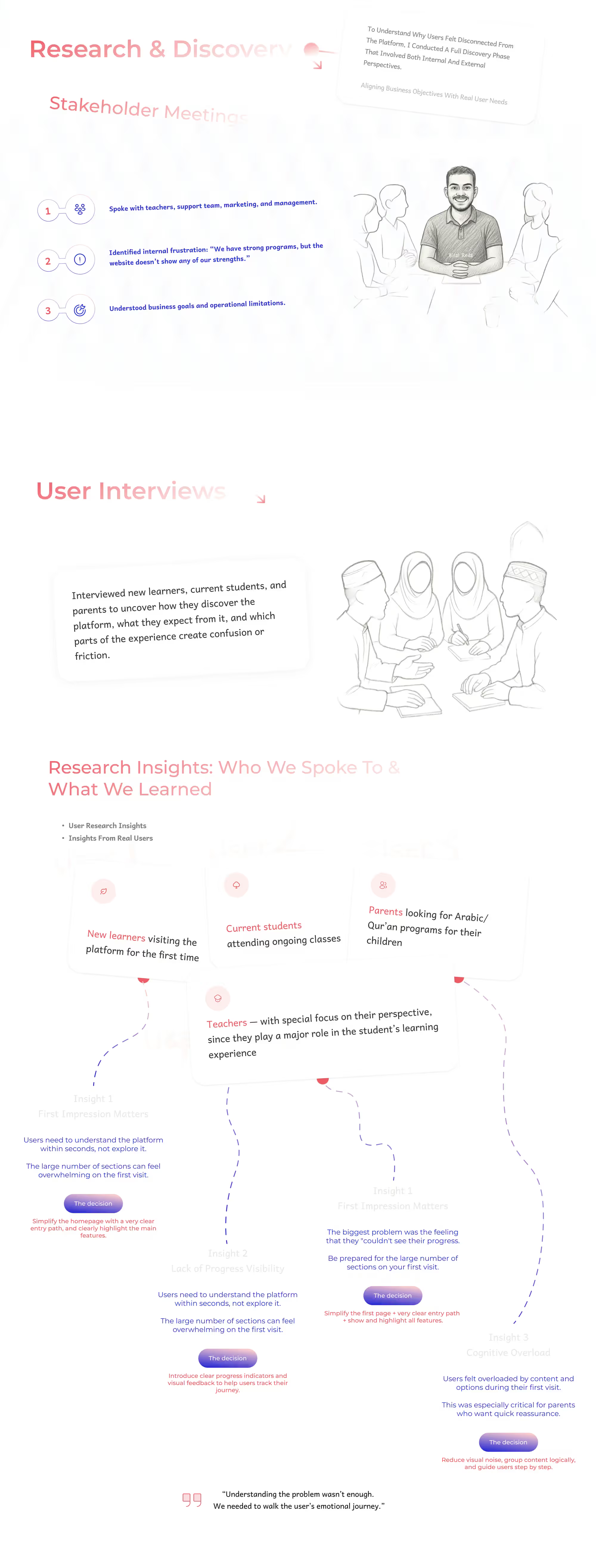
Research before a single pixel
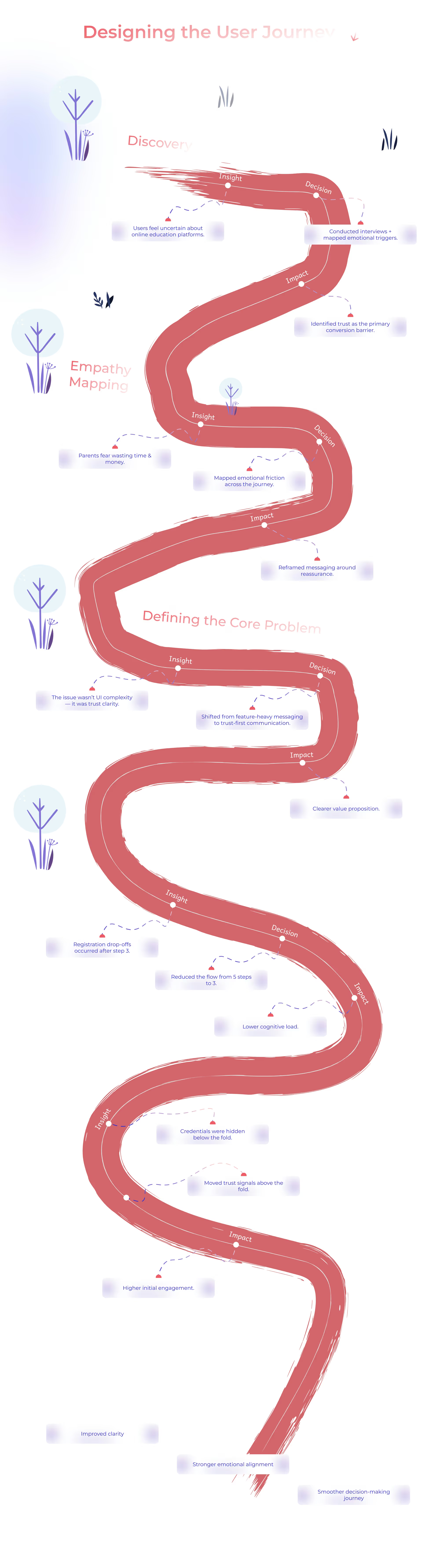
We started by listening, not drawing. We mapped the existing journey, found exactly where visitors stalled, and built an empathy map separating what a student says from what they actually feel and what stops them enrolling. That produced a specific list of blockers, ranked by their effect on the decision to start rather than by how easy they were to fix.
From complexity to confidence
We restructured the information around one question: what does a visitor need to understand before they trust this and begin? Curriculums, tracks, teachers and pricing were ordered to answer questions in the sequence they are actually asked, and the distance from landing to a first real step was cut down.
Wireframes before the interface
Every key screen was drawn in black and white first. The hard calls — what leads, what folds away, where the start button sits — were settled while the design had no colour, so the later conversation never turned into an argument about taste.
A complete interface across the platform
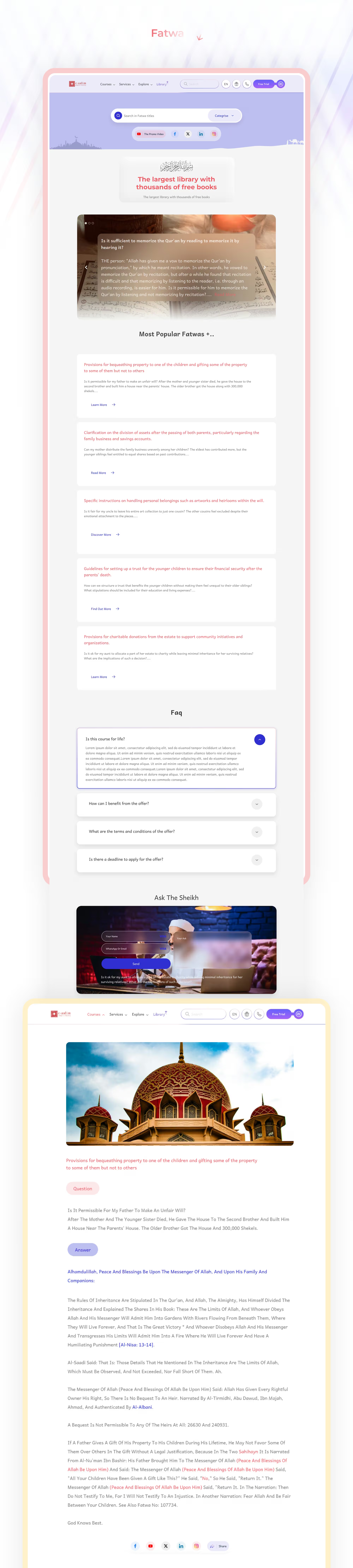
We designed the whole platform, not just its landing pages: the marketing pages, curriculum and article pages, teacher profiles, pricing, FAQ, the library and books, exercises, the blog and the podcast. Every screen holds to the same system, so the platform reads as one product rather than a collection of pages.
A design system that grows with it
The most valuable deliverable wasn't a screen — it was the system underneath: colour, type, spacing and a documented component library. Any page built afterwards comes out consistent by default, and the team doesn't return to a designer for every addition. That is what stops a platform sliding back into disorder a year later.
Arabic design isn't a mirrored copy
The platform speaks to an Arabic-first audience, so Arabic was treated as a native language rather than a translation: typefaces chosen on their own merits, sizing and spacing tuned for right-to-left reading, and layouts that read naturally instead of being flipped in a mirror.