Sirajj Academy — From Visual Identity to a Live Website
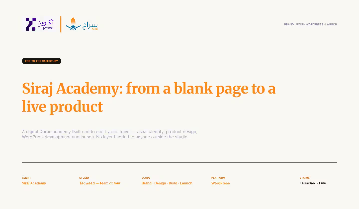
From a name to a live website: we built Sirajj Academy's identity, managed the product, designed the UX/UI, built it on WordPress and oversaw the launch.
Visit the live site sirajj.comOne project, four stages, and no stage handed to anyone else
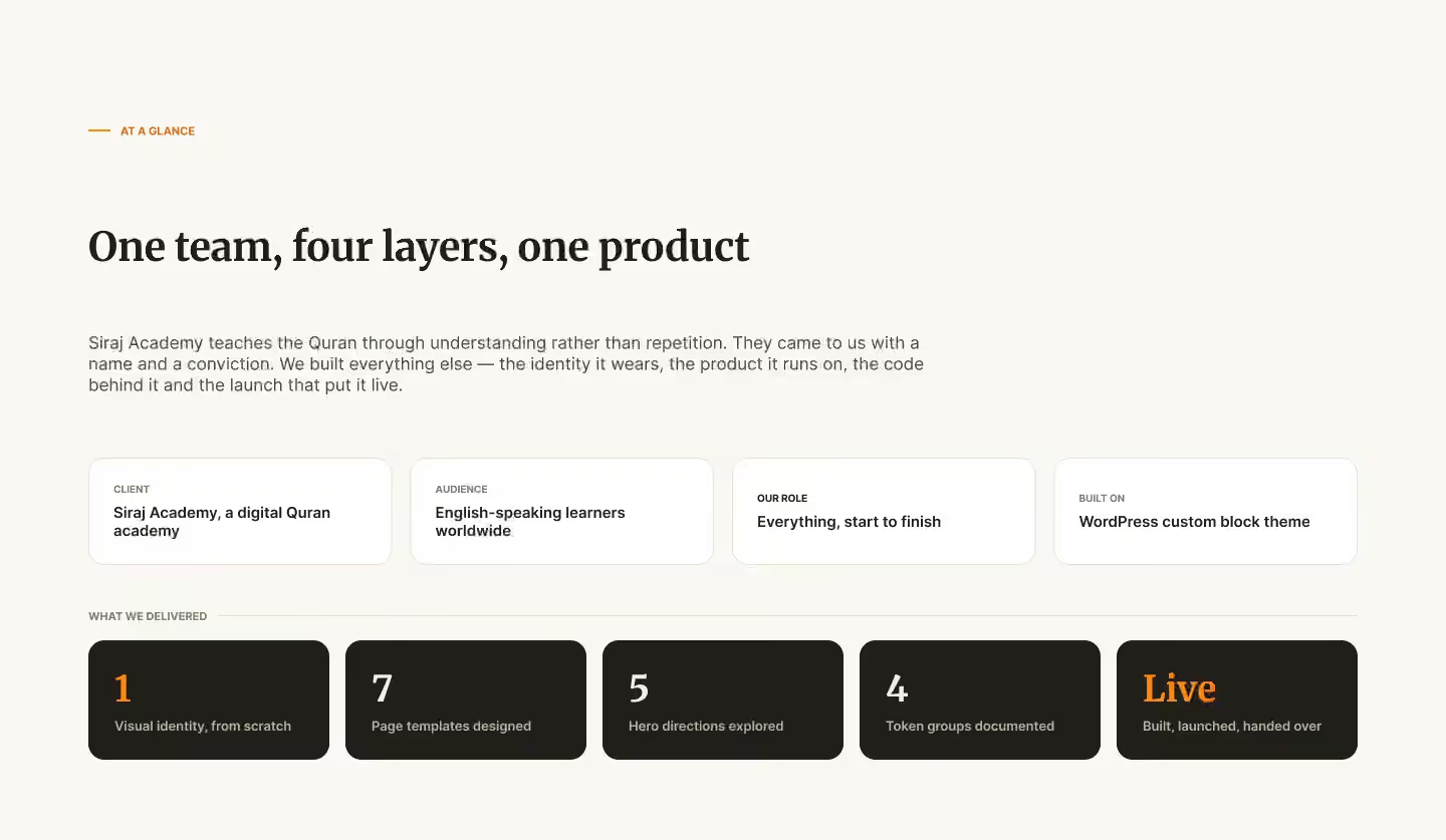
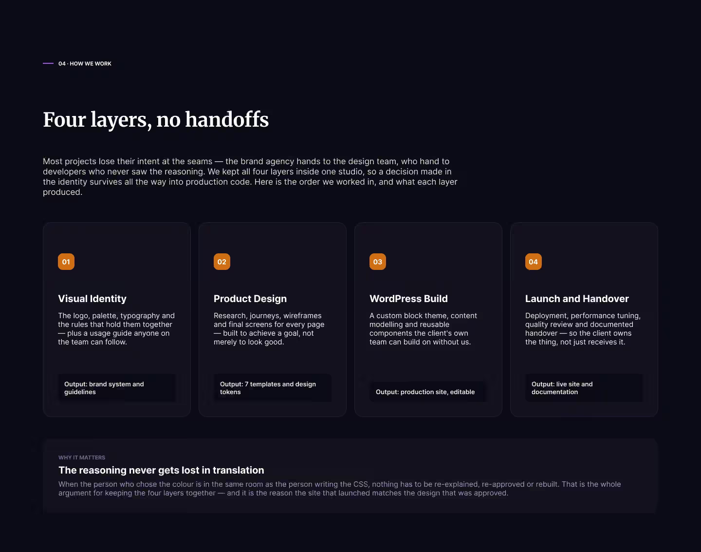
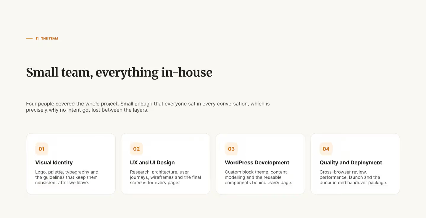
Sirajj Academy is a digital academy for English-speaking learners around the world, built on one clear principle: understanding before memorisation. It came to us with a name and a conviction, and nothing else. Taqweed's team did everything after that — the visual identity, product management, UX/UI design, the WordPress build and a supervised launch on the server — and then handed the academy's own team a site they can run.
- Role
- Brand to launch
- Platform
- WordPress, custom block theme
- Audience
- English-speaking learners worldwide
- Status
- Live
The challenge: a method that had never been shown
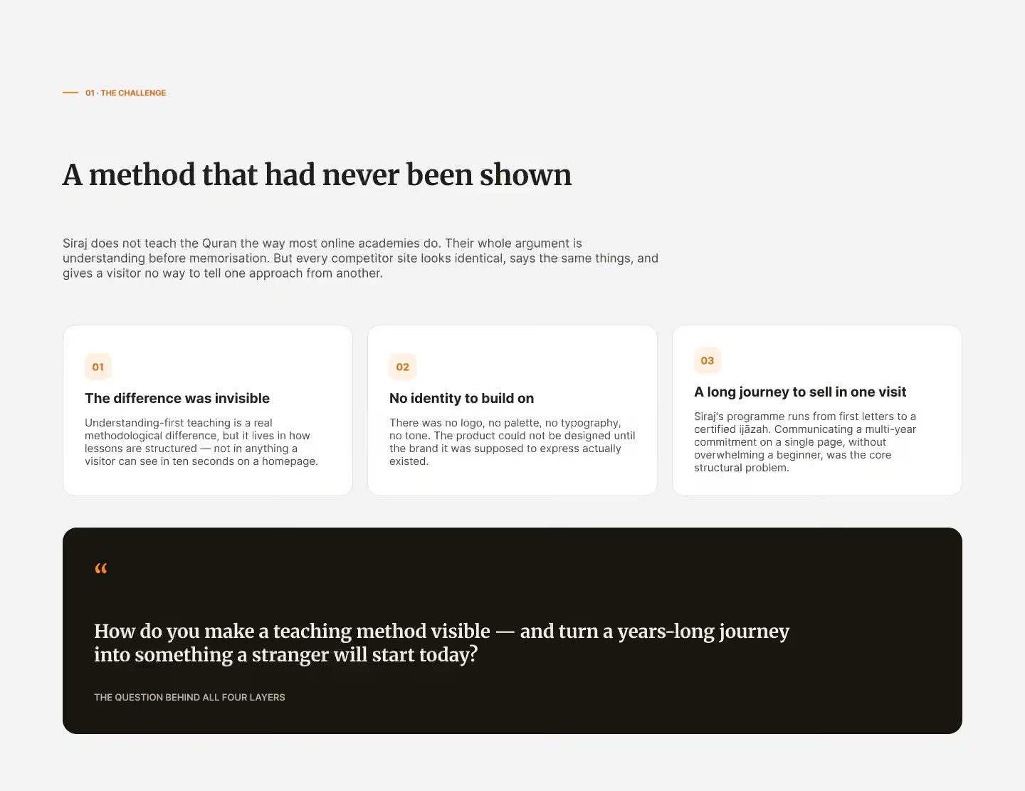
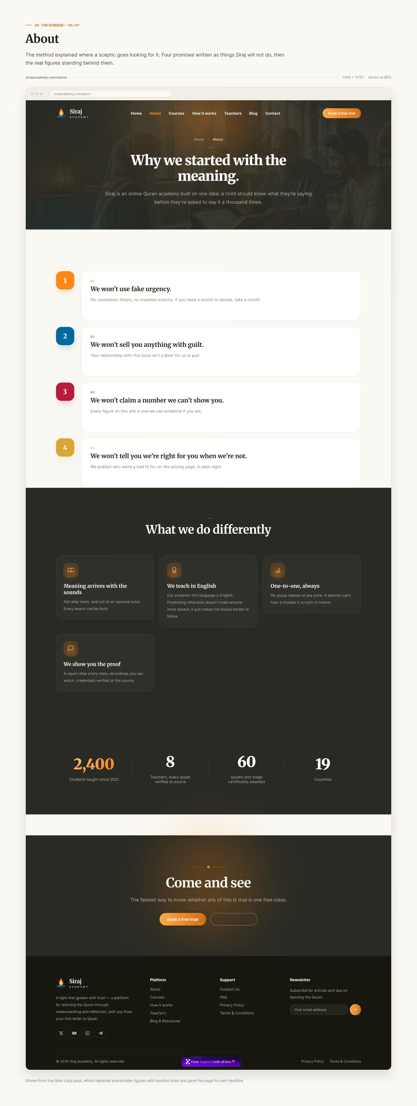
Sirajj teaches differently from most online academies, but that difference lived in how lessons are structured — not in anything a visitor could see in ten seconds on a homepage. There was no identity to build on either: no logo, no palette, no typography. And the learner's journey runs for years, from the first letters to a certified qualification, yet it had to be presented in a single visit without overwhelming a beginner. One question governed all four stages of the work: how do you make a teaching method visible, and turn a years-long journey into something a stranger will start today?
Goals agreed before any design
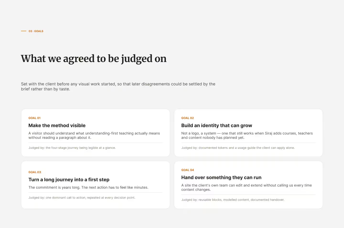
Before any visual work began, we agreed four goals with the client to judge the project by, so that later disagreements could be settled by the brief rather than by taste: a visitor should understand the method without reading a paragraph about it; the identity should be a system that still works when Sirajj adds courses, teachers and content nobody has planned yet; the long journey should become a clear first step, with one call to action repeated at every decision point; and the result should be a site the academy's team can run on its own.
Visual identity: everything starts with the name
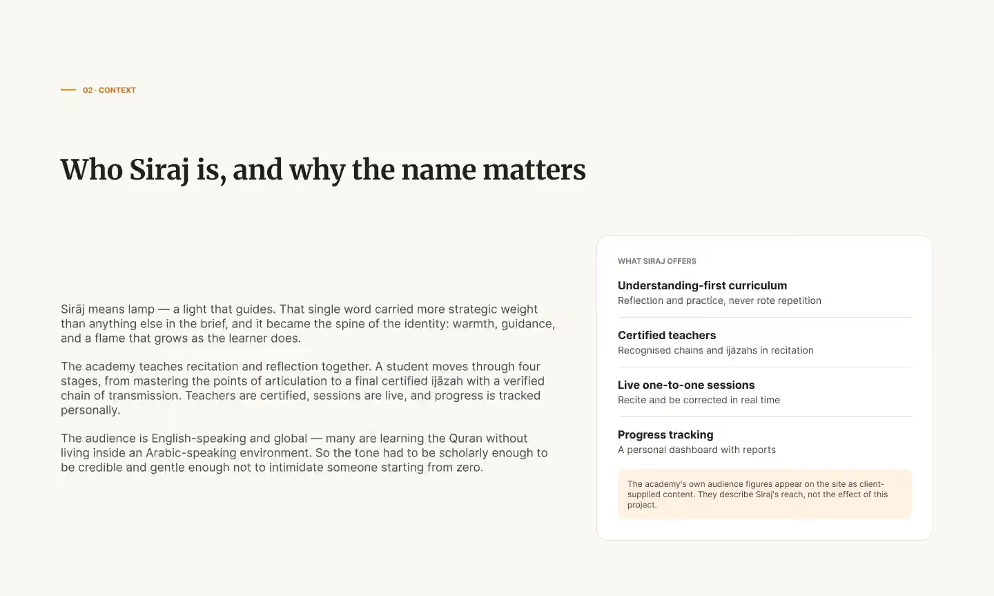
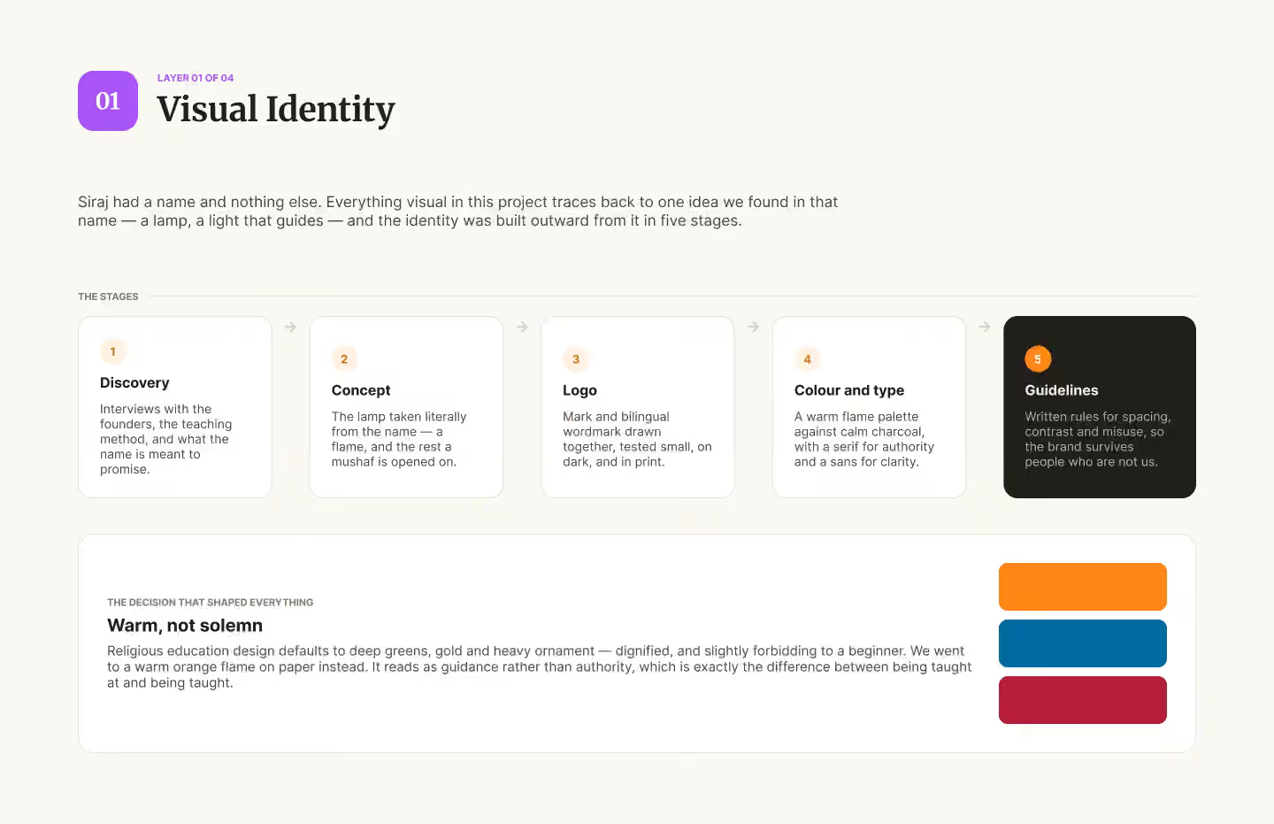
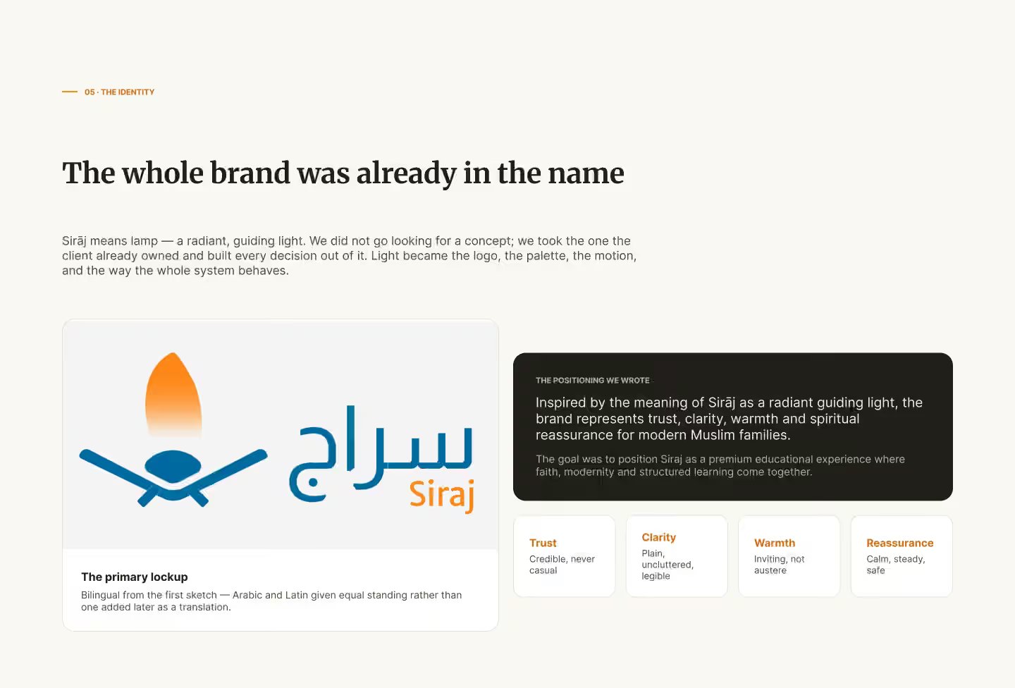
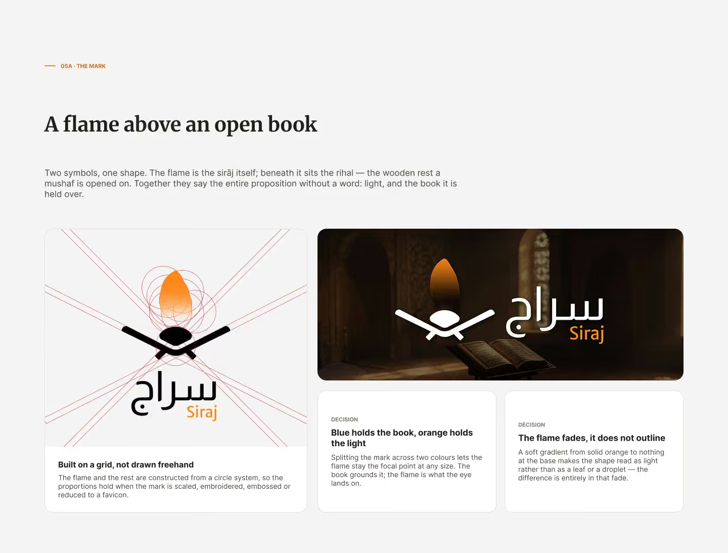
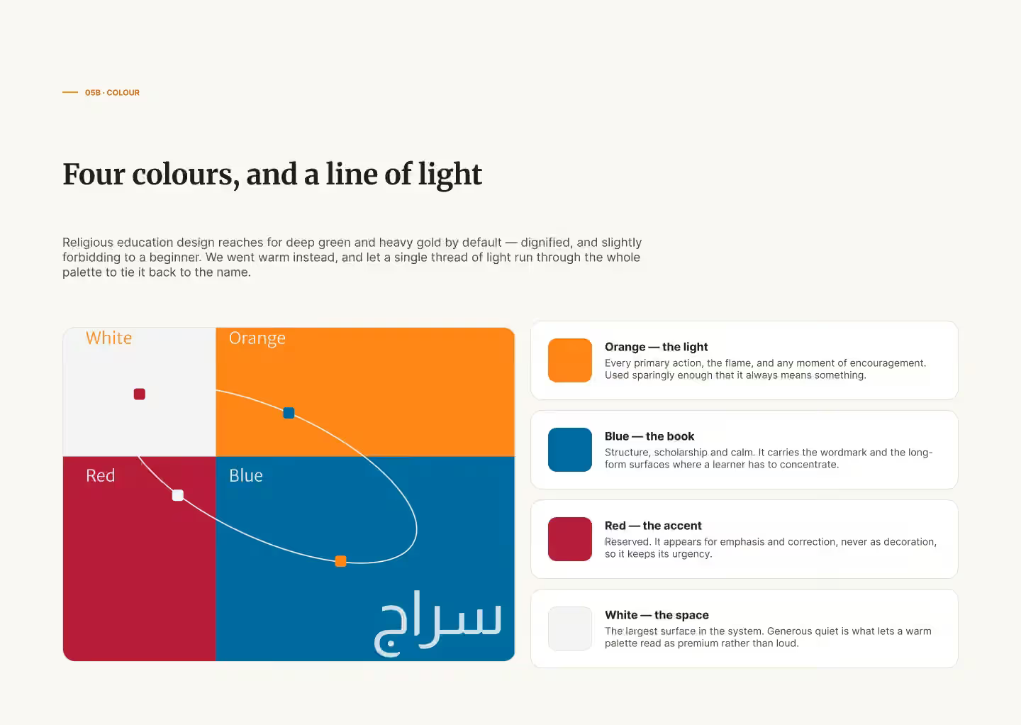
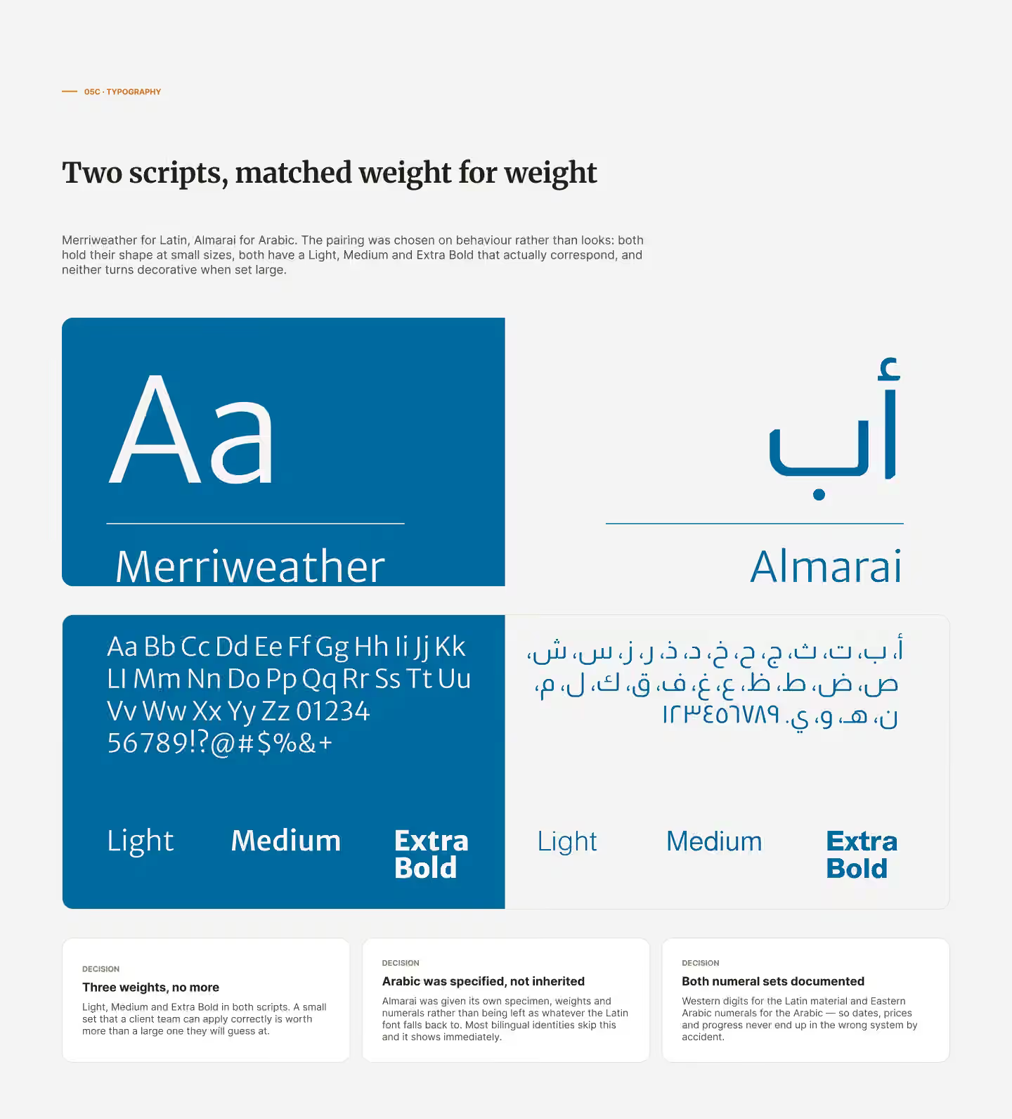
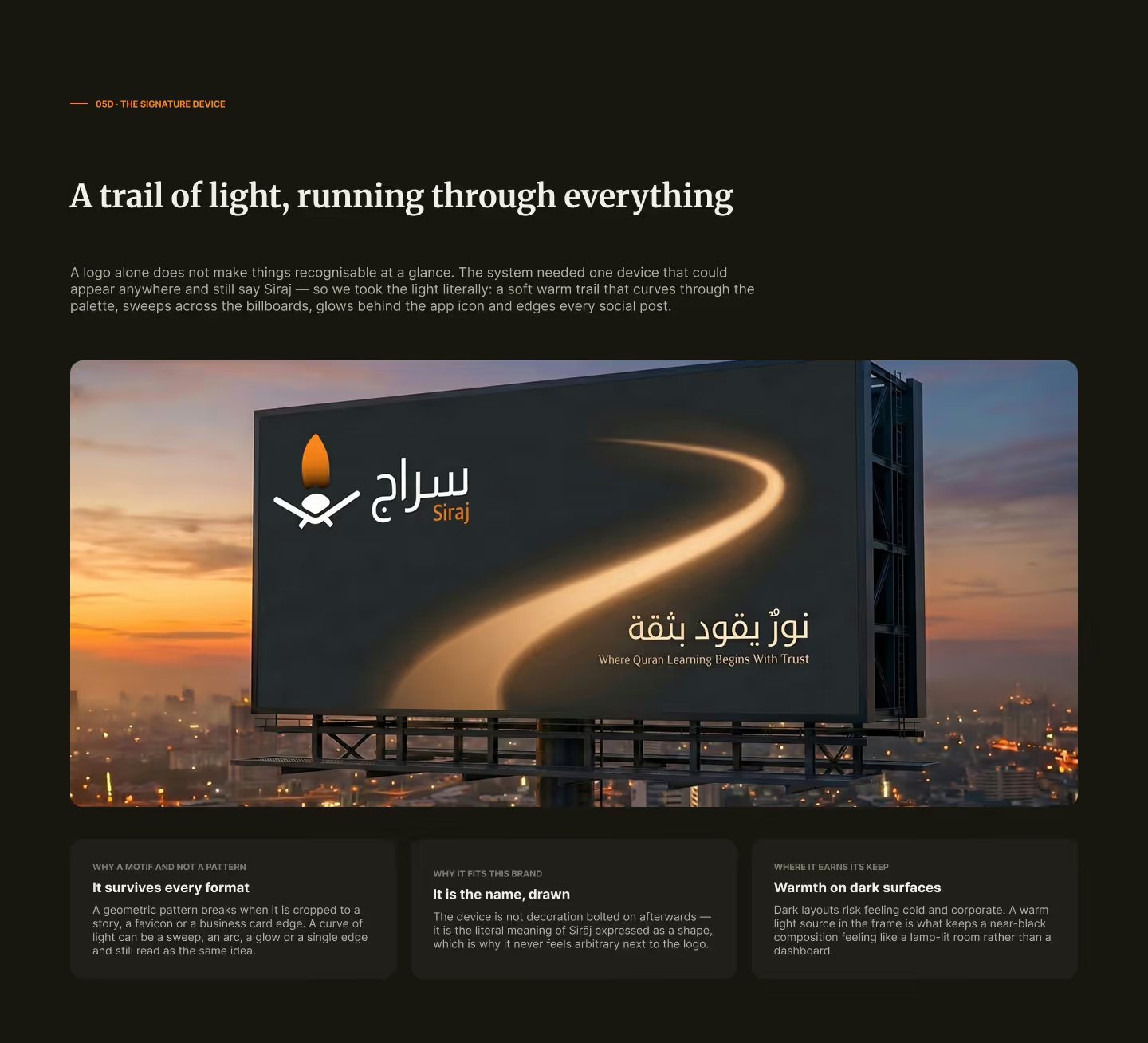
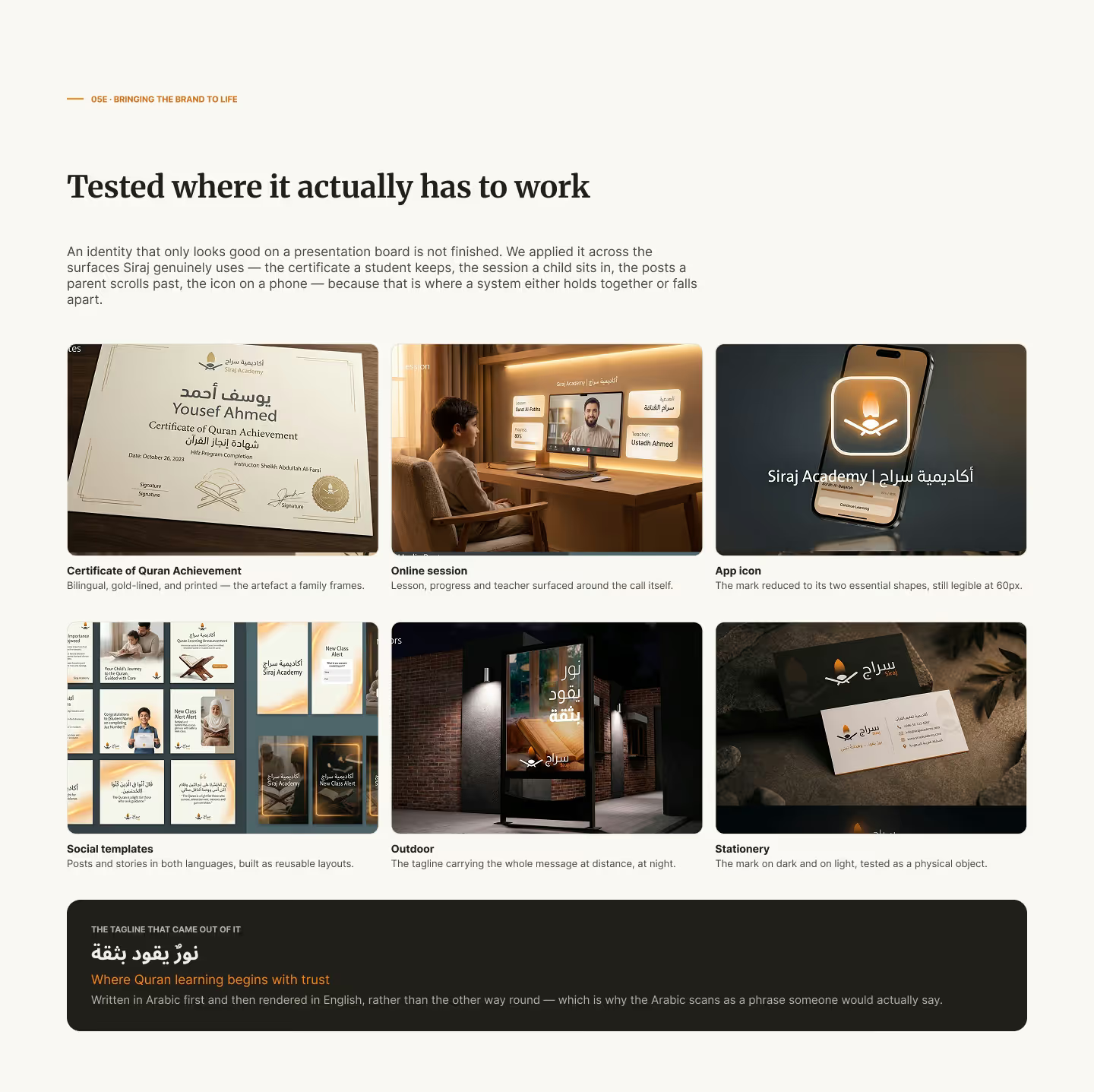
Sirajj takes its name from sirāj, the Arabic word for lamp — a light that guides. The identity was built outward from that idea in five stages: interviews with the founders, the concept, the logo, colour and type, and written guidelines. The mark is a flame above an open book resting on a stand, with a bilingual wordmark tested at small sizes, on dark backgrounds and in print. The decision that shaped everything was warmth over solemnity: education sites in this field default to deep greens, gold and heavy ornament, which can feel forbidding to a beginner, so we chose a warm orange flame on light paper. The palette has four roles — orange for the light, blue for the book, red for emphasis, white for space — paired with Merriweather for Latin and Almarai for Arabic at matched weights.
Product management: seven pages, one job each
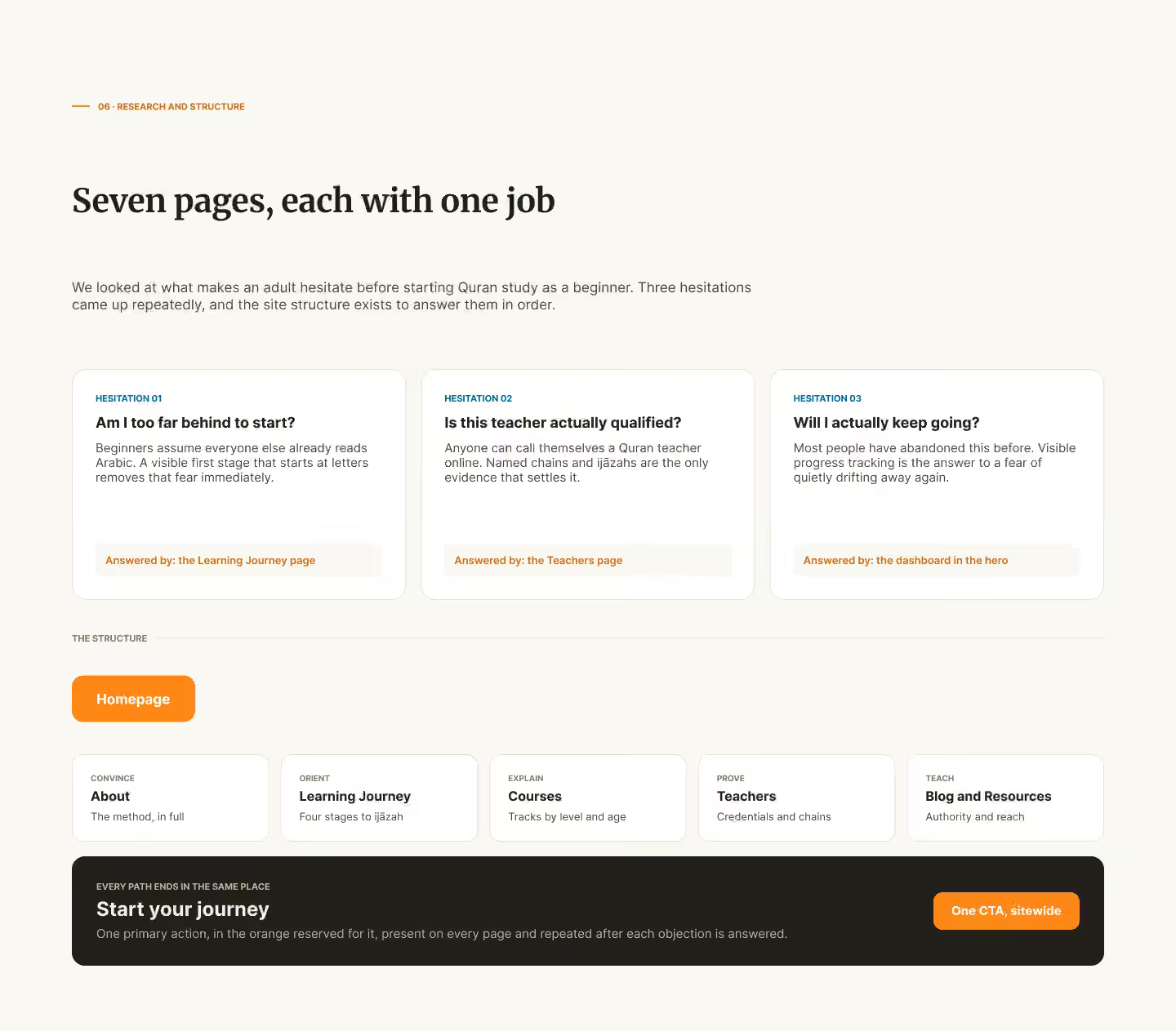
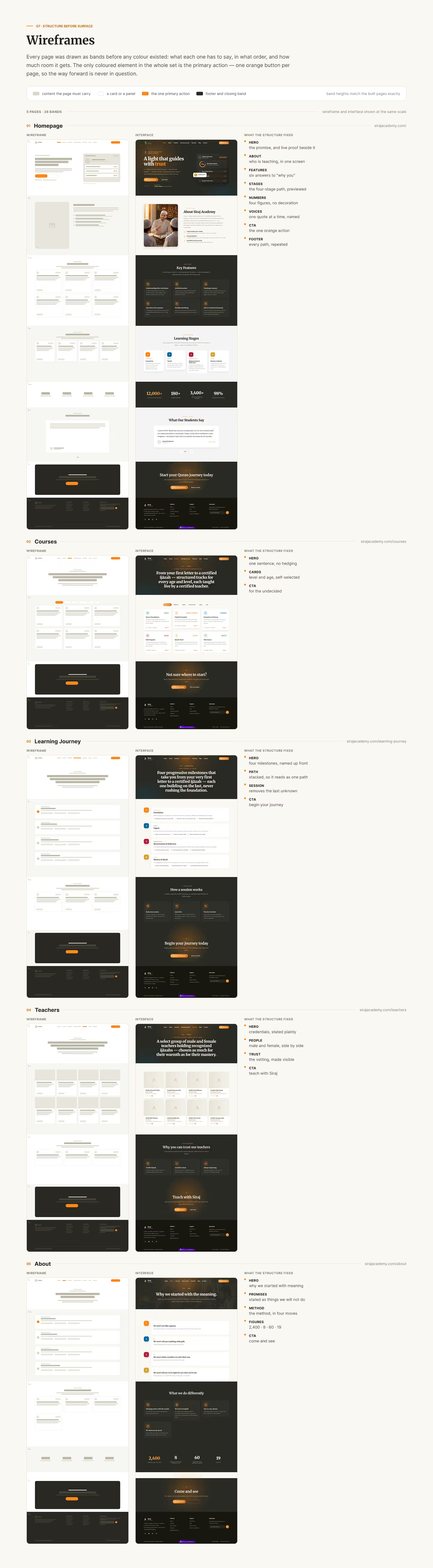
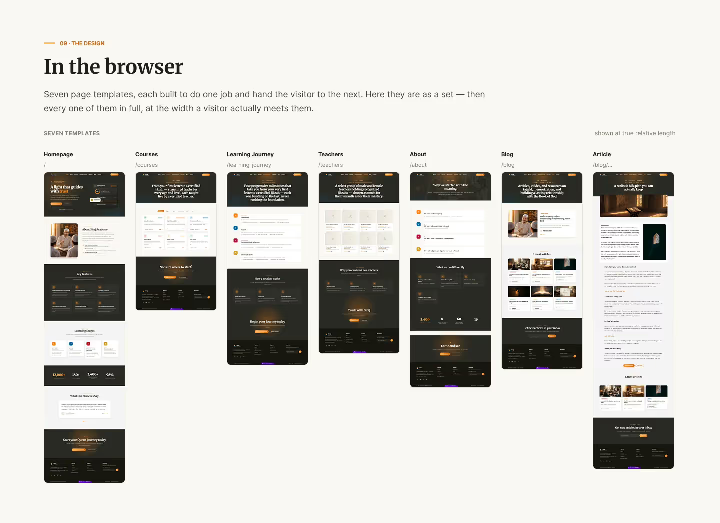
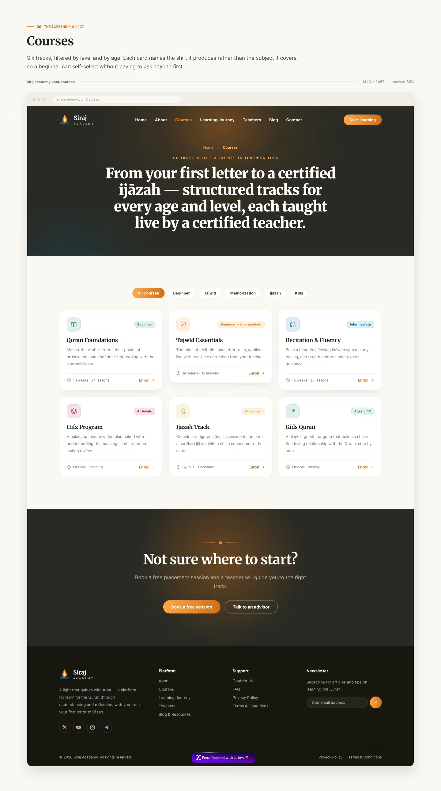
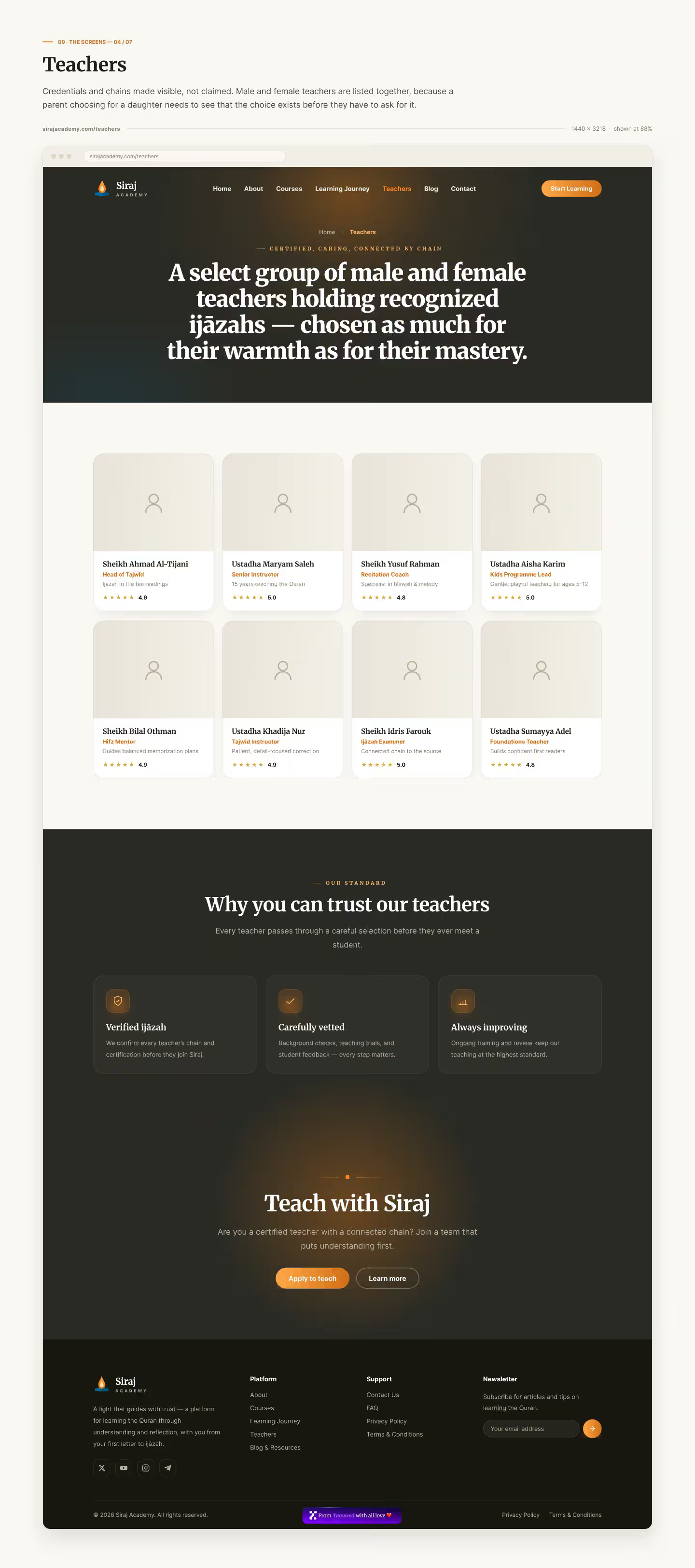
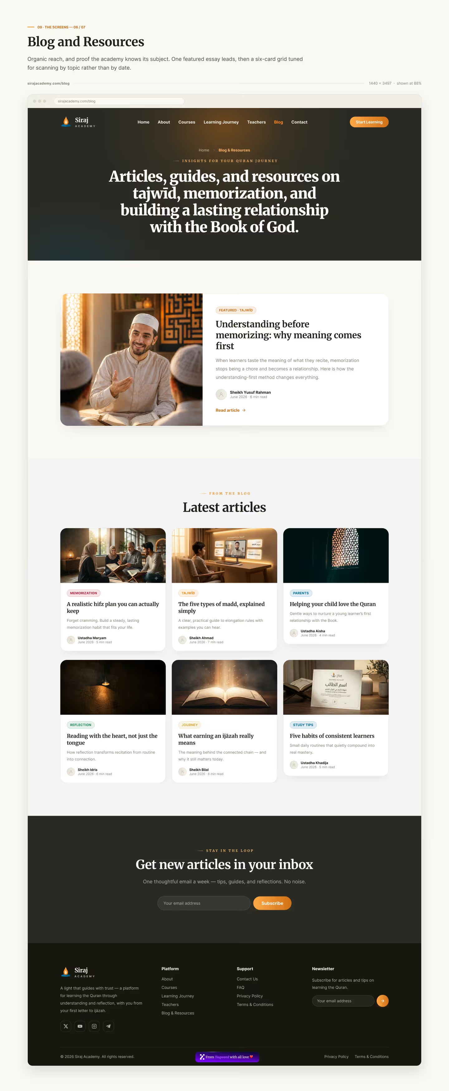
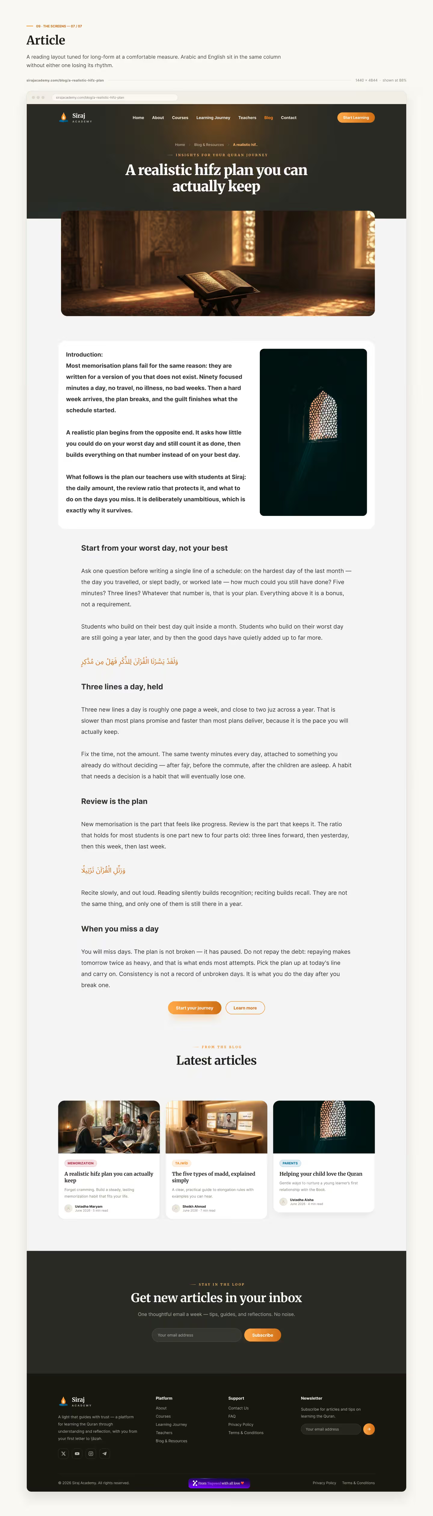
The product work started with a competitor teardown and the real hesitations of adults starting from zero, and the site structure came out of that: home, about, the learning journey, courses, teachers, the blog and the article page. Seven templates, each with one job, all converging on the same single call to action. Our team ran the project from the first interview to the handover, so every decision stayed tied to the goals agreed at the start.
UX and UI: show the method, don't describe it
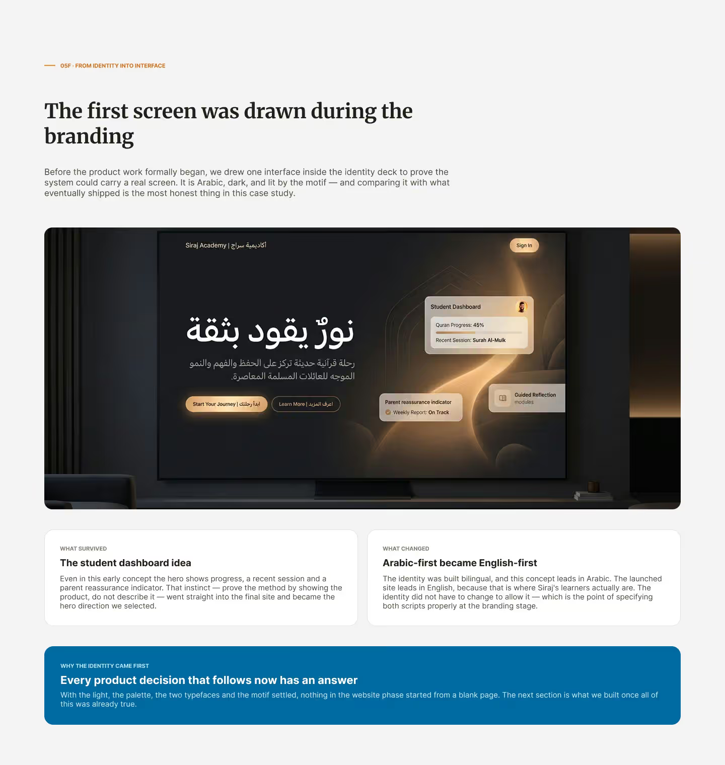
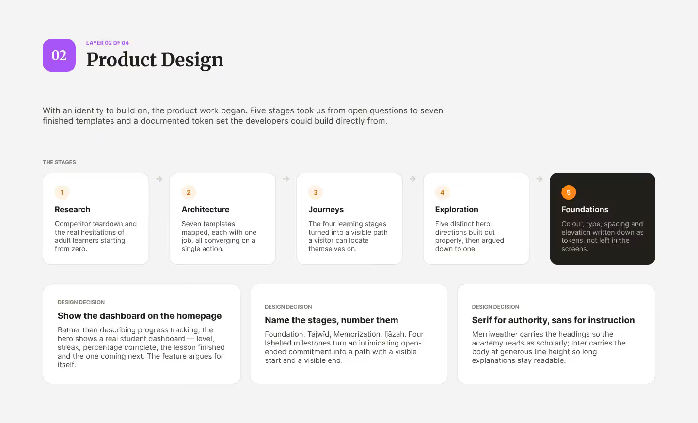
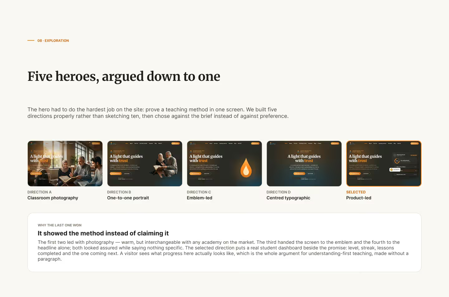
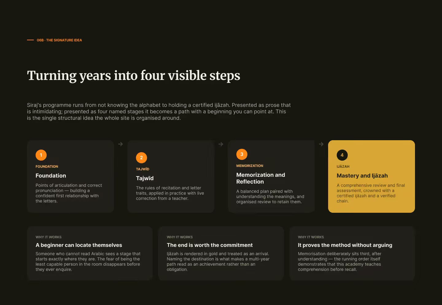
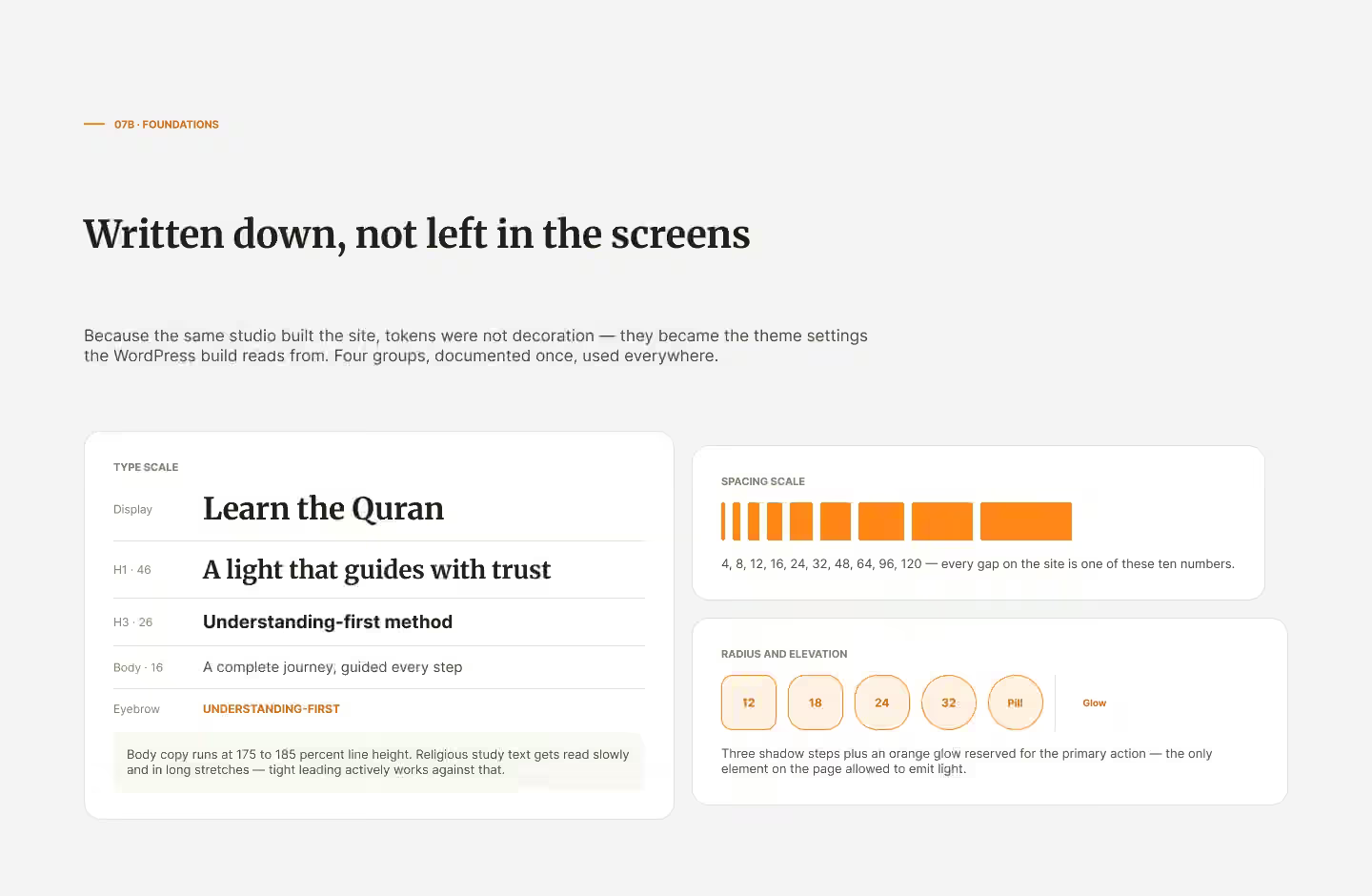
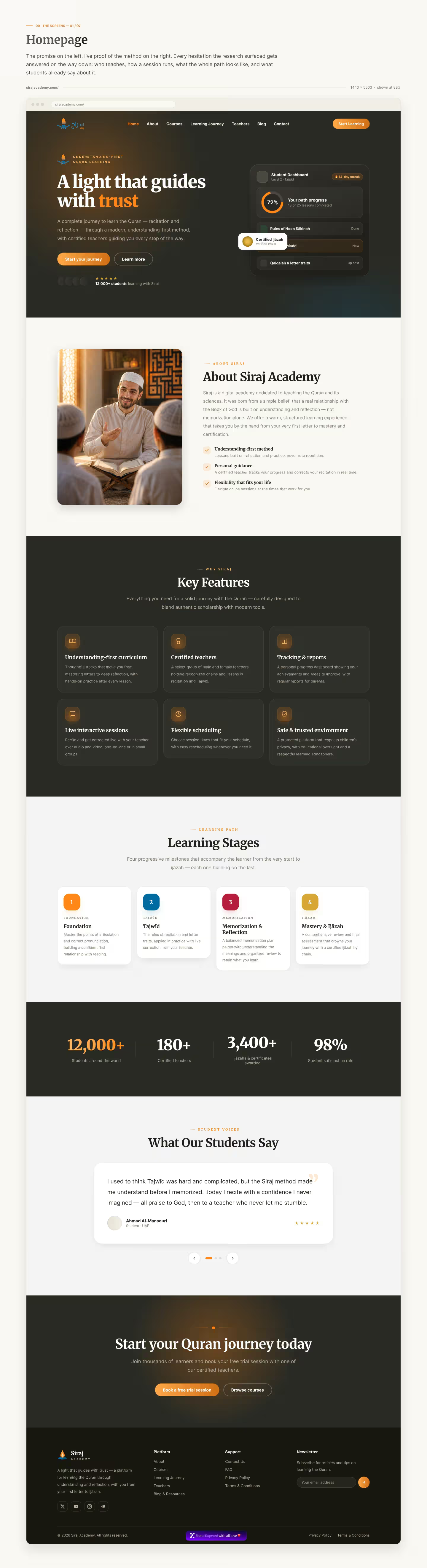
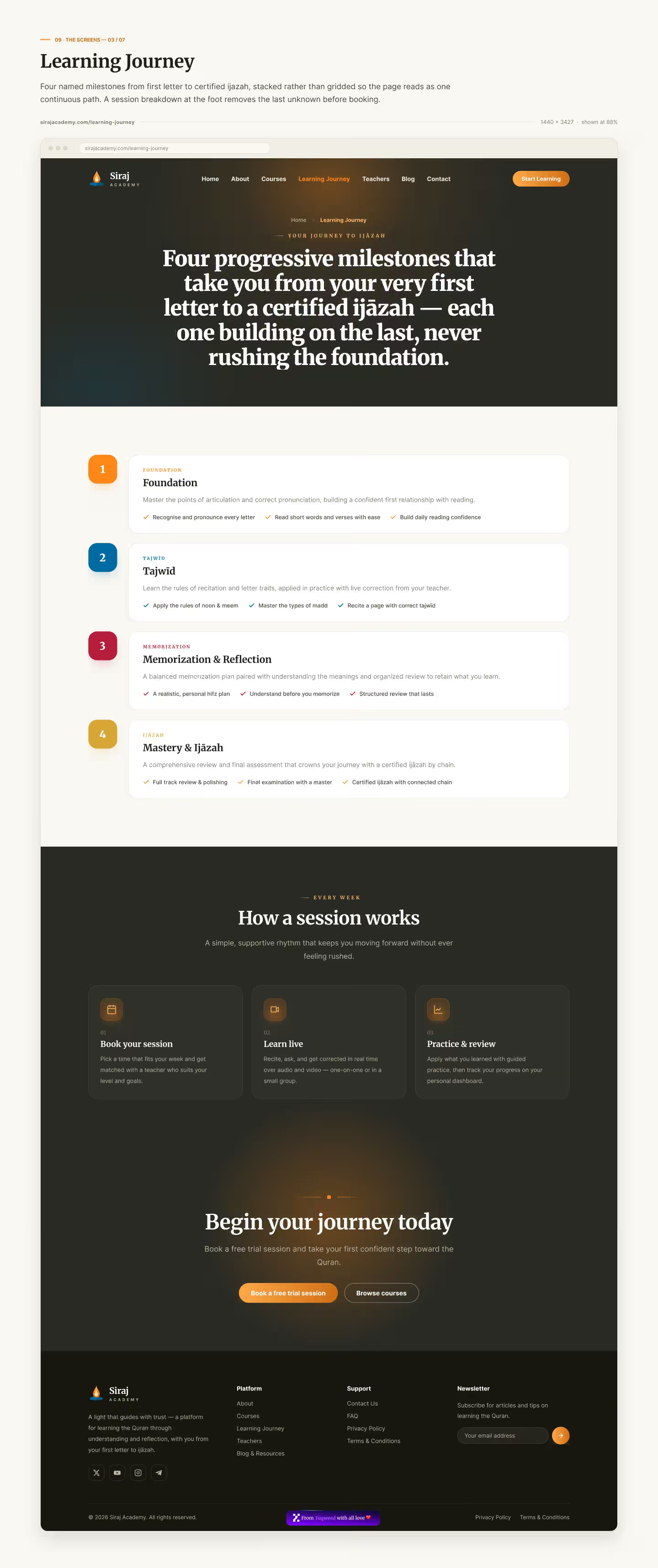
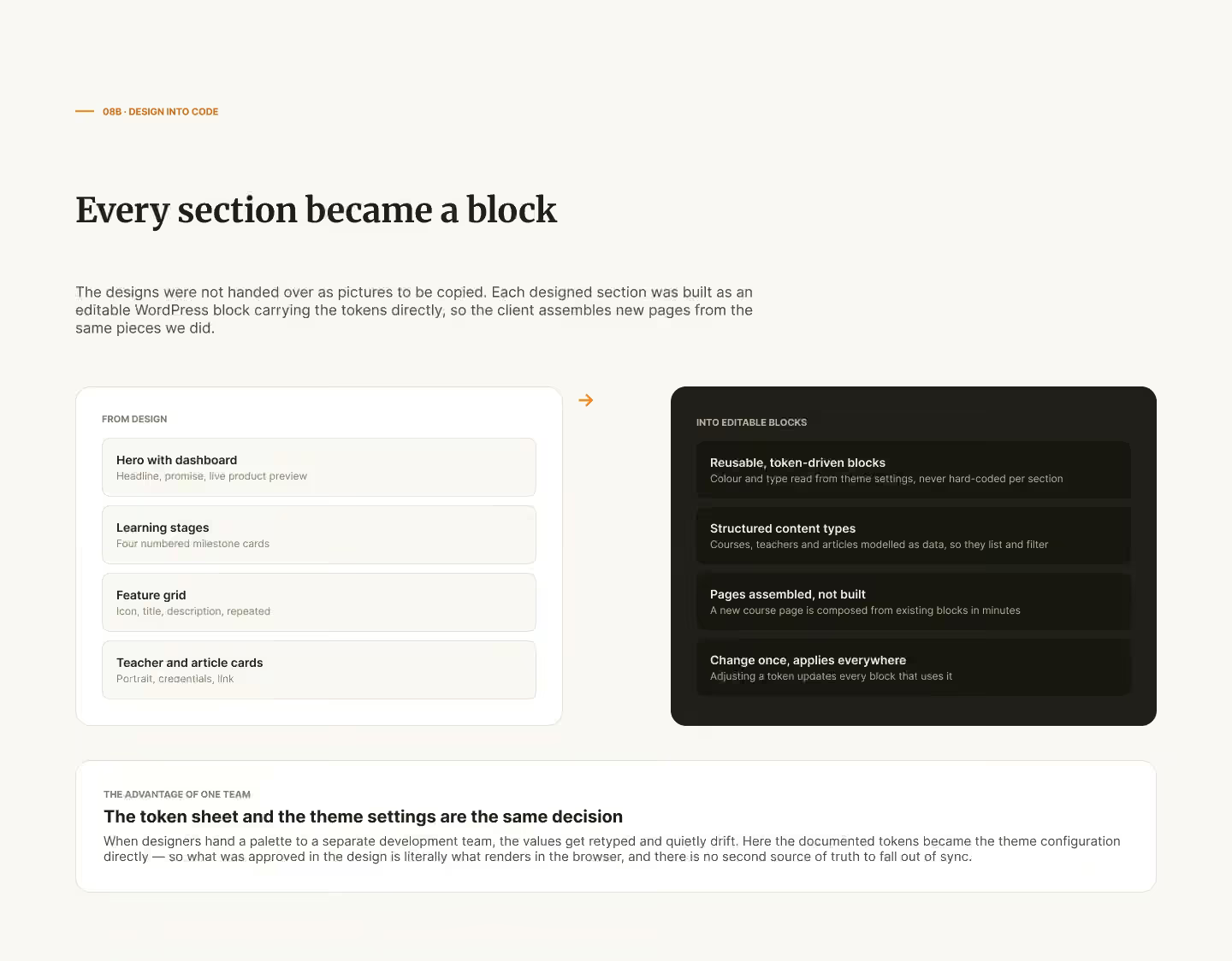
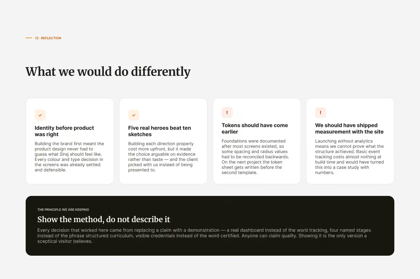
We turned the four learning stages into a named, numbered path a visitor can locate themselves on, from foundation to a certified qualification. We then built five complete homepage directions and chose between them with the client on evidence rather than taste. The one selected shows a real student dashboard instead of describing progress tracking: level, streak, percentage complete, the lesson just finished and the one coming next. The foundations — colour, type, spacing and elevation — were documented as design tokens the developers built from directly, rather than left inside the screens.
The WordPress build: a site the client edits without us
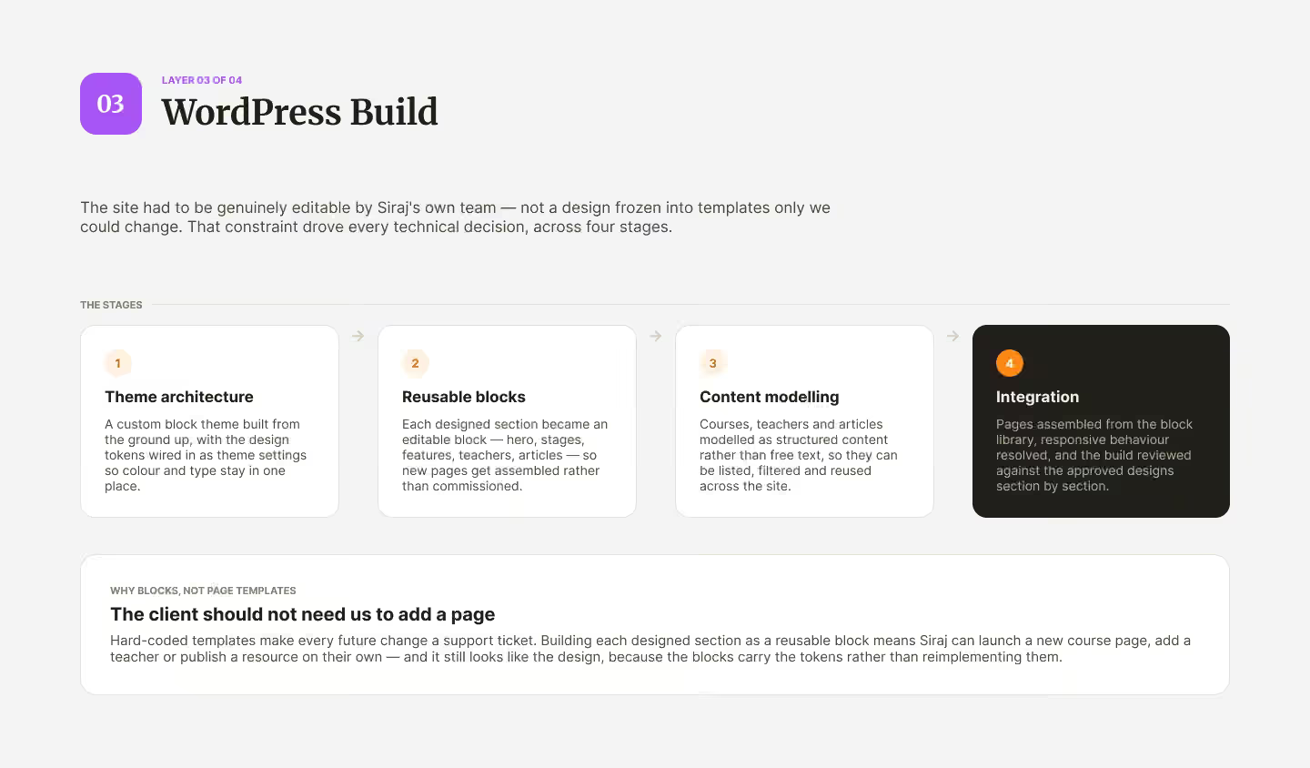
We built a custom block theme from the ground up, with the design tokens wired into its settings so colour and type live in one place. Every designed section became an editable block — hero, stages, features, teachers, articles — so a new page is assembled from the library rather than commissioned. Courses, teachers and articles were modelled as structured content that can be listed, filtered and reused, and the build was reviewed against the approved designs section by section.
Launch and handover: live, and owned by the client
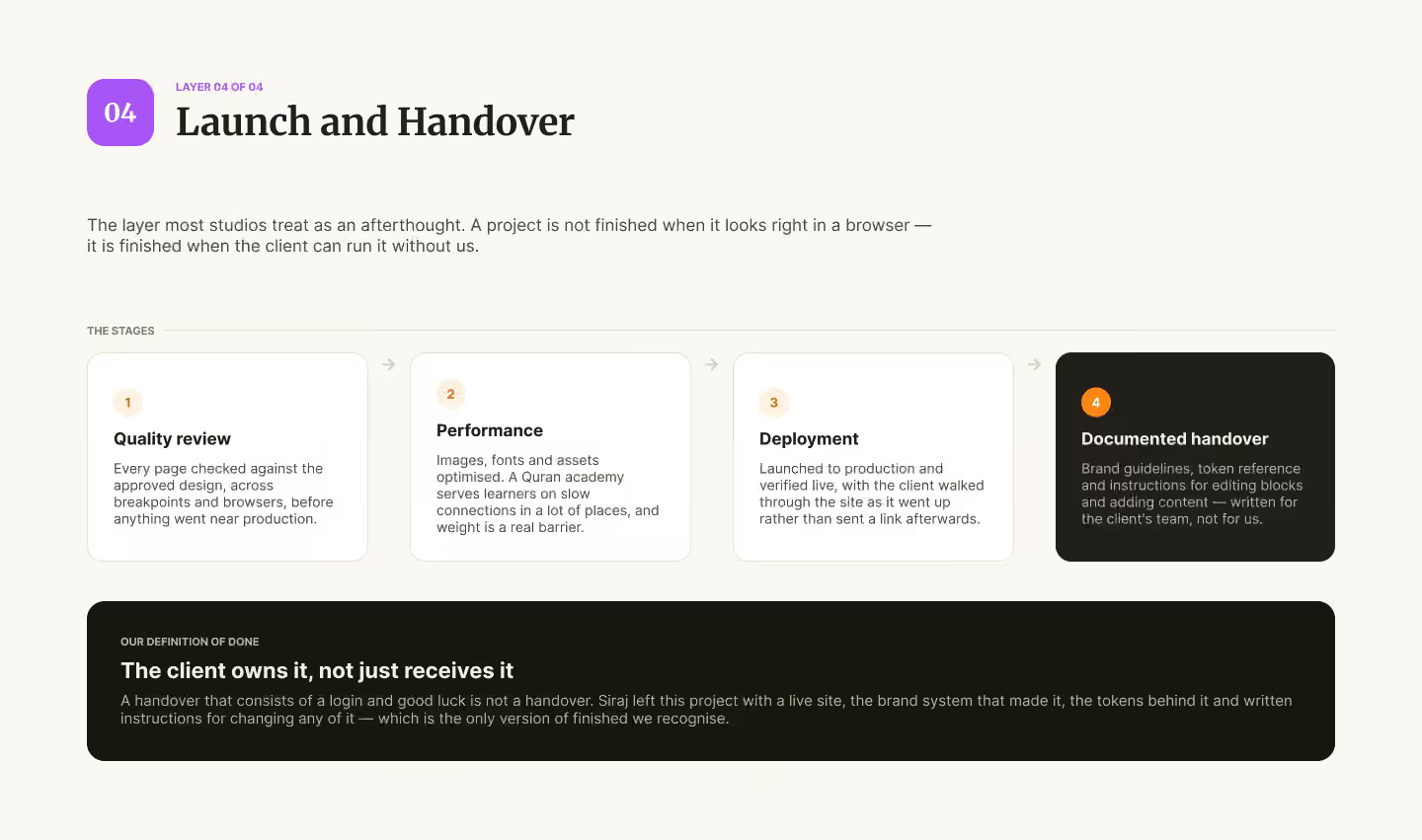
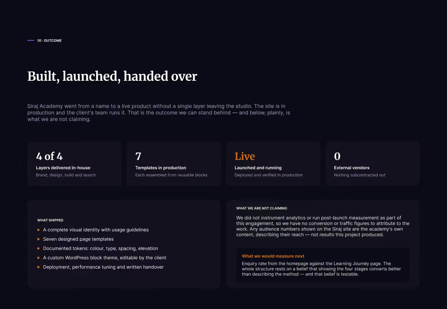
Every page was checked against the approved design across breakpoints and browsers before launch, and images, fonts and assets were optimised because many learners connect over slow networks. We supervised the deployment to the server and verified the site live, walking the client through it as it went up, then handed over the brand guidelines, the token reference and written instructions for editing blocks and adding content. We claim no numbers: measurement was not part of this engagement, so there are no traffic or conversion figures to attribute to it. What we stand behind is that the academy went from a name to a live site its own team runs, without a single stage leaving our team.