SkillNest — UX/UI Design for a Mobile Learning App
We designed SkillNest from research to final interface: a mobile learning app that serves two audiences at once — individuals who subscribe monthly or buy a single course, and company employees who unlock their partnership discount with a work email or a company code.
One learning app, designed for two very different users
SkillNest is a mobile app for learning professional and creative skills through online courses. It serves two kinds of learner: individuals who subscribe monthly or buy one course at a time, and employees of partner companies who learn at a discount. We designed the experience from research through to the final interface around one aim — to get each of them from the first screen to their first lesson with as little friction as possible.
- Role
- Research, UX and UI
- Sector
- E-learning
- Platform
- Mobile app
- Users
- Individuals and company teams
The challenge: two audiences, one app
Most learning apps are built around a single buyer. SkillNest had to serve two at the same time: an individual paying for themselves, who wants a clear price and a simple way to start, and an employee whose company has partnered with the platform, who wants the discount they are entitled to without chasing anyone for it. Designing for only one of them means losing the other.
Research: what the big platforms leave out
We reviewed Udemy, Coursera, Skillshare and LinkedIn Learning, and held Q&A sessions with people who had faced these challenges while working from home. The pattern was consistent: platforms sell either per course or by subscription, and none combines both with a company-sponsored discount. Corporate plans such as Coursera for Business are built for large organisations, and onboarding and payment steps are often long and complex, especially for a new user.
Omar and Sara: two users, two needs
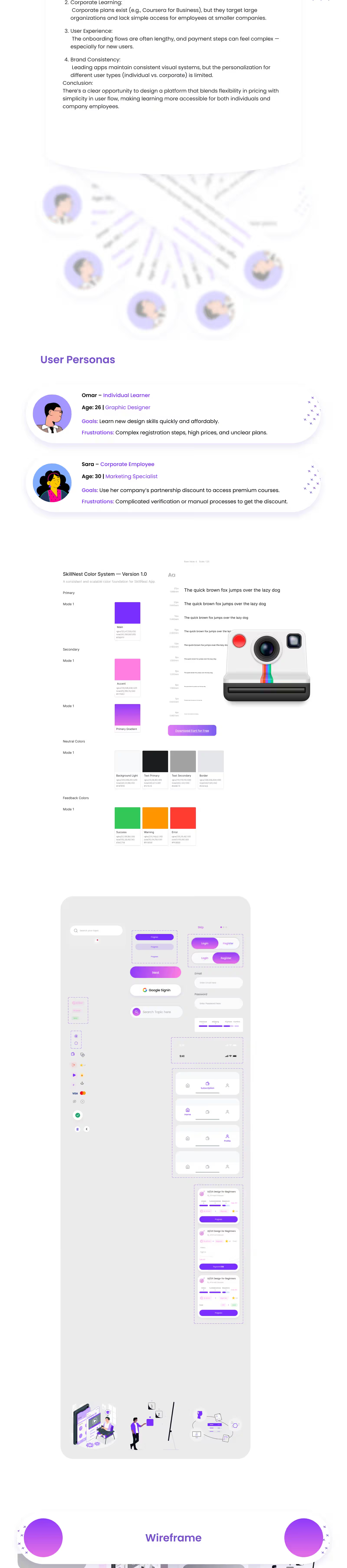
Two personas kept the design honest. Omar, 26, is a graphic designer paying for himself: he wants to learn new design skills quickly and affordably, and is put off by complicated sign-ups, high prices and unclear plans. Sara, 30, is a marketing specialist whose company has a partnership with the platform: she wants to use that discount to reach premium courses, and is held back by complicated verification and manual steps. Every screen had to work for both of them.
A discount that applies itself
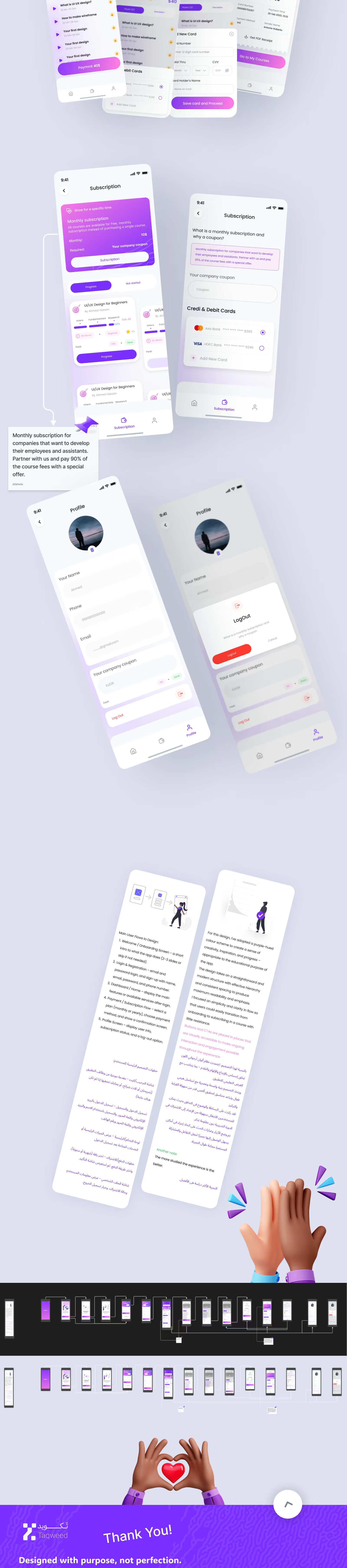
The idea at the centre of the design: an employee should not have to go through a manual process to get a discount their company has already arranged. The app is designed to recognise a partner company's email domain, or to accept a code issued by the company, and to apply the discount without anyone approving it by hand. Companies get a way to train their staff with no extra administrative work, and employees go straight to the course.
Structure before colour
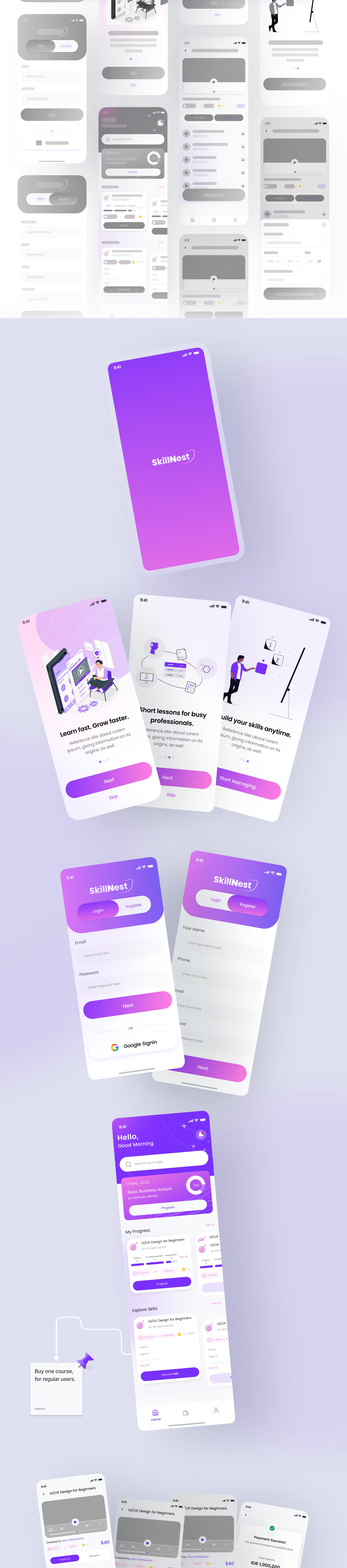
Before any visual design, we fixed the five flows the app depends on: a short onboarding that can be skipped; login and registration; the home screen; payment and subscription, ending on a confirmation screen; and a profile showing the user's details and subscription status. Every key screen was drawn as a grey wireframe first, so decisions about order and hierarchy were settled before colour could pull attention away from them.
A visual system built to grow
The interface sits on a documented foundation: a colour system with a primary purple, a pink accent and a gradient between them, a set of neutrals, and dedicated colours for success, warning and error states — alongside a type scale and a component library of buttons, input fields, course cards with progress bars, bottom navigation and a step-by-step checkout. Purple was chosen for what it signals in an educational product: creativity, inspiration and progress.
From the first screen to the first lesson
The final interface follows the learner from start to finish: a three-screen onboarding that can be skipped, sign-in with an email address or a Google account, and a home screen that opens on the course in progress with its completion percentage. Each course page pairs a video player with the lesson list and a description; payment supports saved cards and ends on a confirmation screen with a PDF receipt; and the profile keeps the company code and subscription status in one place. A full user-flow map shows how every screen connects to the next.