
UI Design: What Are You Actually Buying When You Pay for It?
UI design is not decoration added at the end. It translates experience decisions into screens that make the right decision on the user's behalf. Paid for properly, it delivers screens for real states, a component library, and handoff files a developer can build from without guessing.
Ask two studios to quote the same set of screens. The prices will differ threefold, and nothing on paper will explain why. The reason is rarely greed. Interface design is usually bought without a definition: nobody states what the work includes, or what should be in your hands when it ends.
This guide is written from the selling side of the table, so you walk into your next meeting knowing what to ask for. We won't re-explain the difference between UX and UI; that has its own article. We won't cover right-to-left rules or brand typeface selection either; each has its own guide. This is about the craft of the interface itself: hierarchy, components, consistency, and handoff. In other words, what separates a proposal worth its price from a pretty drawing.
What is UI design, really?
The definition we work by at Taqweed: UI design is the translation of experience decisions into screens that make the right decision on the user's behalf. A good screen doesn't present ten options and step back. It makes the correct action the biggest, clearest thing on the page, closest to the thumb. It tucks everything else where only those who need it will look. When a user says "the app is easy," they are describing decisions made for them that they never felt.
Decoration is the thing it gets mistaken for. The most expensive misunderstanding in this purchase is treating the interface as a paint layer over a finished product. That belief is exactly why quotes vary threefold. One seller prices days of drawing. The other prices thinking through every state every screen will pass through. Same headline, very different service.
Hierarchy: where do I look first, and what do I do now?
Every successful screen answers those two questions before the user reads a single word. The tools are only four: size, weight, colour, and spacing. The largest heading says "start here." The one saturated colour says "this is the button." The empty space around an element says "this matters." Nielsen Norman Group's guidance sums it up: good visual hierarchy lets users grasp the relative importance of elements without conscious effort.
Our strictest rule: one screen, one primary action. When two buttons share the same size and colour, the screen tells the user "you decide." That is the opposite of its job. The test is cheap. Show the screen to a stranger for three seconds. Then ask what the page does and what they should do next. If they hesitate, the ordering failed, not their intelligence.
And remember which screen we are talking about. The CST Saudi Internet Report 2024 puts internet penetration at 99%, with mobile as the browsing device in 99.4% of usage. The interface you are buying in Saudi Arabia is a phone screen, one thumb wide. A layout that feels comfortable on the meeting-room display can collapse entirely at pocket width.
Components and their states: the work you never see
The screen in the sales deck shows the ideal case: full data, short names, perfect connection. A live product spends its life in the other cases. A field that rejected input. A list with nothing in it. A request stuck on a weak connection. Each component needs a design for every state it can enter: default, hover, pressed, disabled, loading, empty, and error.
In our experience, two states expose a product's real quality: empty and error. The empty state is the first thing every new user sees, yet it gets designed last or not at all. The error message is your interface at its user's worst moment. Nielsen Norman Group's guidance is blunt here: say what happened in human language, and say what to do next. "Something went wrong" is not a design. It is the absence of one.
| Component | The states clients forget to ask about |
|---|---|
| Input field | Validation error, disabled, text longer than expected |
| List or table | Completely empty, one item, thousands of items |
| Primary button | Loading, disabled, double-tap |
| Search | No results, connection lost |
| Profile | User with no photo, a very long name |
When you compare two proposals, ask both one question: are the states included in the price? The answers will tell you which side has shipped a living product before.
Consistency, and where it lives
Users don't learn your screens; they learn your system. When the save button sits in the same place with the same shape everywhere, people stop searching for it after the first time. Design every screen fresh, in the taste of the day it was drawn, and users pay a new learning tax on every page. Your developers build every element twice. Nielsen Norman Group places consistency at the heart of usability for exactly this reason.
Consistency also has an address: the design system, the library that documents colours, spacing, and components with their states so parts are reused, not reinvented. It deserves its own guide, and it has one. Its commercial effect fits in one sentence: in a consistent project, the third screen is faster and cheaper than the first, because it is assembled from existing parts rather than drawn. If every small change to your product needs a designer again, you don't own an interface. You own a wall of adjacent paintings.
One product, two languages: Arabic and English as equals
Your market almost certainly reads both. A customer in Jeddah browses in Arabic while a supplier in Dubai uses the same dashboard in English. A serious interface is designed for both from the first component, because the same sentence stretches and shrinks between languages. The button that fits "Save" may not fit "حفظ التغييرات". A heading that breaks across two lines in Arabic may sit on one line in English.
Some details run deeper than length. Numbers and currency placement follow their own rules. Not every element mirrors when the direction flips: progress bars mirror, media icons don't. You only need to know these rules exist; our Arabic interfaces guide covers them in full. Ask anyone quoting you one question: how do you test screens in both languages? The typeface itself is a brand decision made before the project, and our Arabic typography guide covers that choice. What matters at signing is simple: both languages priced and treated as equals, not one shipped as a translation bolted on later.
Accessibility is interface work, not a later phase
WCAG 2.2, published by the W3C in 2023, turned much of what used to be "taste" into checkable requirements. Colour contrast has minimum ratios. Touch targets have a minimum size. Keyboard focus must stay visible as you move through a page. These items live in the interface layer, the exact work this contract covers. Retrofitting them later costs far more than designing them in.
Accessibility buys durability for everyone, and the small group it is named after simply feels the absence first. The contrast a low-vision user needs is the same contrast that saves a delivery rider reading his phone in midday Riyadh glare. A generous touch target serves the commuter typing one-handed as well as it serves a trembling hand. When you see accessibility in a proposal, you are not paying for a certificate. You are paying for screens that work in the conditions your users actually live in.
What you should receive from UI design work
Complete UI deliverables come to four things. Ask for them by name.
Screens for real states, not the happy path. Every key screen with its empty, error, loading, and long-text versions. Count the states in the proposal, not the titles.
The component library. Buttons, fields, and cards documented with their states as reusable parts, not as flat layers in a closed file. That library, with component states documented for every item in it, is what makes the next page cheaper than the last one.
Handoff specifications. Spacing, sizes, and behaviours written down so a developer builds without personal interpretation. Design handoff fails the same way: flat images without specs mean the design gets reinvented in code.
An answer to the weight question. A heavy interface is a business cost, not a taste issue. Deloitte's study for Google, Milliseconds Make Millions (2020), found that a 0.1-second improvement in mobile speed lifted retail conversions by 8.4%. Ask whoever you hire how they keep shadows, imagery, and motion from costing you those tenths.
Before signing, ask who owns the files, how many revision rounds are included, and who will actually do the work. Our guide to hiring a UX design agency covers the full procurement checklist, and it applies here word for word.
Related reading: design system, ui/ux design.
Core Web Vitals reference: Google web.dev — Core Web Vitals.
Similar News
View All News
Hiring a UX Design Agency: What You Actually Get, and How to Measure the Return
resources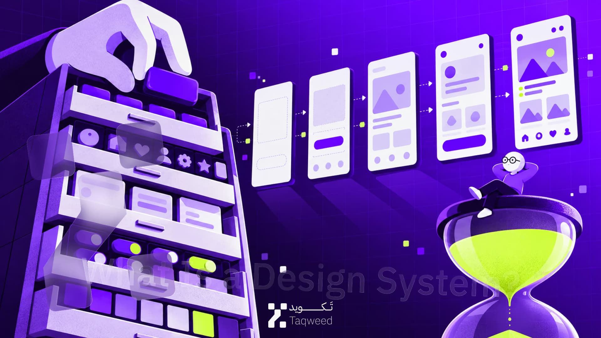

Common Questions
UX decides what happens and why; UI decides how it looks and feels on the screen. One is the structure of the journey, the other its rooms and doors. We unpack the difference with practical examples in a dedicated article, so we won't repeat it here. For a buying decision, it's enough that a serious proposal names them as separate lines of work.
There is no standard number, and the better question is how many states. One screen with six states can equal the effort of six static screens. A "simple" ten-screen product can exceed sixty designed states. Ask any proposal to count screens by their states, not their titles. You will see immediately who estimated the work and who guessed a number to fit the budget.
No. They are designed together from the first component. Each decision, a button's width or a field's length, is tested in both languages before it is approved. What fits in English can overflow in Arabic, and the reverse. Designing in one language and "localising" the file later produces a second-class version, and fixing it costs more than designing it right from the start.
Figma is the standard tool for this work today, mainly for its component libraries and direct developer handoff. But the tool matters less than ownership. The source files and the component library must transfer to you in full at the final payment, under your own account, not the agency's. A proposal that doesn't state this in writing deserves a direct question before you sign.
The time scales with the number of screens, their states, and whether a component library already exists. A small, tightly scoped product takes a few weeks. A product with dozens of bilingual screens can take months. Be wary of "everything in a week." It usually means a happy path with no states, or a template that dresses your product the way it dresses a thousand others.
Sometimes, and honesty matters here. If the user journeys are sound and the problem is clarity and consistency, refreshing the UI design layer alone delivers real impact at lower cost. But if users get lost in the flow itself rather than its appearance, repainting the screens is paint over a crack. The crack returns in the first analytics report.